2.7 Data visualisation with ggplot2
2.7.1 Background
In the previous exercises you cleaned and summarised biodiversity data using the tidyverse. You can now answer questions like “which country has the most palm records?” or “what is the earliest collection year?”. Numbers and tables are precise, but they are not always the fastest way to communicate a pattern, detect an outlier, or build intuition about a dataset. That is where visualisation comes in.
In this session we will use ggplot2, the tidyverse package for graphics. ggplot2 is built around a coherent framework called the Grammar of Graphics: every plot is assembled from a small set of building blocks. Once you understand the logic, you can build almost any chart by combining those blocks, rather than memorizing a separate function for each plot type.
2.7.2 Learning objectives
By the end of this session, you will be able to:
Understand the basics of “Grammar of Graphics” and use it to build plots with
ggplot2.Create common plot types, including scatter plots, histograms, bar charts, box plots, and faceted plots.
Customise plots using aesthetics, themes, labels, and
ggsave()to produce clear, high quality figures.
2.7.3 Literature
Wickham H, Cetinkaya-Rundel M & Grolemund G (2023) ggplot2: Elegant Graphics for Data Analysis. https://ggplot2-book.org/
2.7.4 Required preparation
Read through this introduction to ggplot2: https://ggplot2.tidyverse.org/articles/ggplot2.html
2.7.5 Why do we plot data?
Before calculating statistics or fitting models, we should always look at the data. A plot is often the fastest way to understand what a dataset contains, what problems it may have, and which biological patterns may be worth exploring further. Plots help us see:
- which values are common and which are rare
- whether variables are evenly distributed or strongly skewed
- whether different groups show different patterns
- whether there are unusual values, outliers, or possible data errors
- whether two variables may be related
- whether patterns change through time
In biodiversity research, plotting is especially important because datasets are often complex. They may include many species, countries, record types, missing values, uneven sampling effort, and strong differences among taxonomic or geographic groups.
Plotting is therefore a central part of exploratory data analysis. It helps us detect problems, discover patterns, generate new questions, and communicate results clearly. A good plot does more than showing your data: it helps tell the scientific story, which is really important for scientific papers.
2.7.6 The Grammar of Graphics
The Grammar of Graphics is an idea introduced by Leland Wilkinson that describes how data visualizations are built from a small set of reusable components. Instead of treating each plot type as something completely separate, it breaks every graphic into parts: the data, the variables we want to show, the visual properties used to show them, and the geometric objects used to draw them.
In ggplot2, this means that we build plots step by step. We start with a dataset, map variables to aesthetics such as position, color, size, or shape, and then choose a geometry such as points, bars, lines, or boxes to represent the data.
This grammar makes plotting more flexible and systematic. It helps us understand how plots work, how to modify them, and how to use visualizations for exploratory data analysis: finding patterns, detecting problems, comparing groups, and communicating biological results clearly. Every ggplot2 graphic is built from three essential components:
- Data - The data frame you want to plot -
ggplot(data = ...) - Mapping / Aesthetics - Connects variables in the data to visual properties, such as x-position, y-position, color, size, or shape -
aes(x = ..., y = ...) - Layer / Geom - Tells R how to draw the data: as points, bars, lines, boxes, etc. -
geom_point(),geom_histogram(), etc.
These are combined with +, just like pipes in dplyr:
# DO NOT run in R, this is just to see the structure of a ggplot
ggplot(data = DATA, aes(x = VARIABLE_1, y = VARIABLE_2)) +
  geom_SOMETHING()
Additional components — scales, facets, themes, and labels — are optional layers that refine the plot.
- Scales - Control how data values are translated into axes, colors, legends, or transformations -
scale_x_log10() - Facets - Split one plot into several smaller plots for different groups -
facet_wrap(~ country) - Coordinates - Control how positions are displayed -
coord_flip() - Labels - Add titles, axis labels, captions, and legend titles -
labs() - Themes - Control the visual style of the plot, such as background, grid lines, text size, and legend position -
theme_minimal()
2.7.6.1 Creating a ggplot
We will keep working with the palm dataset you already know, including four traits, two categorical traits - UnderstoreyCanopy and fruit Conspicuousness; and two continuous traits - maximum stem height and average fruit length. You can download today’s dataset from ILIAS.
# If you already installed tidyverse, you do not need to install it again

# Just load the package
library(tidyverse)

palm_traits <- read.csv("data/palm_4traits.csv")

glimpse(palm_traits)
## Rows: 250,000
## Columns: 14
## $ family <chr> "Arecaceae", "Arecaceae", "Arecaceae", "Arecacea…
## $ genus <chr> "Hyospathe", "Mauritia", "Cryosophila", "Chamaed…
## $ species <chr> "Hyospathe elegans", "Mauritia flexuosa", "Cryos…
## $ decimalLongitude <dbl> -65.490000, -69.976556, -89.030000, -76.850000, …
## $ decimalLatitude <dbl> -16.520000, 4.733778, 18.230000, -2.530000, -7.8…
## $ country <chr> "Bolivia", "Colombia", "Mexico", "Ecuador", "Per…
## $ locality <chr> "Bolivia, Chapare province, Village San Benito, …
## $ stateProvince <chr> "Chapare/Beni", "Vichada", "Quintana Roo", "Lore…
## $ year <int> 2010, 2021, 2010, 2011, 2009, 2025, 2025, 2011, …
## $ basisOfRecord <chr> "HUMAN_OBSERVATION", "HUMAN_OBSERVATION", "HUMAN…
## $ UnderstoreyCanopy <chr> "canopy", "canopy", "canopy", "understorey", "ca…
## $ Conspicuousness <chr> "cryptic", "conspicuous", "cryptic", "cryptic", …
## $ MaxStemHeight_m <dbl> 8.0, 35.0, 10.0, 4.5, 25.0, 20.0, 35.0, 7.0, 20.…
## $ AverageFruitLength_cm <dbl> 1.150000, 7.000000, 1.250000, 1.250000, 8.250000…Let’s build a ggplot2 plot step by step.
We start with the function ggplot(), which creates an empty graph.
 We have given
 ggplot2 the data, but we have not yet told it which variables to show or how to draw them.
For that, we define the variable mapping with the function aes(). This tells ggplot2 which columns should be connected to visual properties such as the x-axis, y-axis, color, or size. Let’s tell ggplot that MaxStemHeight_m should be mapped to the x-axis and AverageFruitLength_cm to the y-axis.
However, we still do not see the observations (data points) because we have not chosen a geom. A geom is the geometric object used to draw the data. Different geoms create different types of plots. All geom functions in ggplot2 start with geom_.
| Question | Plot type | ggplot2 geom |
|---|---|---|
| How are two numeric variables related? | Scatter plot | geom_point() |
| How is one numeric variable distributed? | Histogram | geom_histogram() |
| How many observations are in each category? | Bar chart | geom_bar() |
| How do values differ among groups? | Boxplot | geom_boxplot() |
| How does something change through time? | Line plot | geom_line() |
2.7.7 Scatter plots - geom_point()
A scatter plot shows the relationship between two numeric variables. Each point represents one observation, with one variable on the x-axis and the other on the y-axis.
Scatter plots are useful when we want to see whether two variables are related, for example whether taller palms tend to have larger fruits.
First, we will create a new data frame containing only the unique palm species and their two trait values. We will use function distinct() from the dplyr package. This avoids plotting the same species-level trait values multiple times and makes the plot faster in R.
# One row per species — we do not want to repeat the same trait value 250,000 times
species_traits <- palm_traits %>%
  select(species, UnderstoreyCanopy, Conspicuousness, MaxStemHeight_m, AverageFruitLength_cm) %>%
  distinct() %>% # keep unique species rows only
  glimpse()
Now we can finally add the geom_, in this case geom_point(), and create our first ggplot!
# Basic scatter plot
ggplot(data = species_traits,
       aes(x = MaxStemHeight_m, y = AverageFruitLength_cm)) +
  geom_point()
## Warning: Removed 506 rows containing missing values or values outside the scale
## range (`geom_point()`).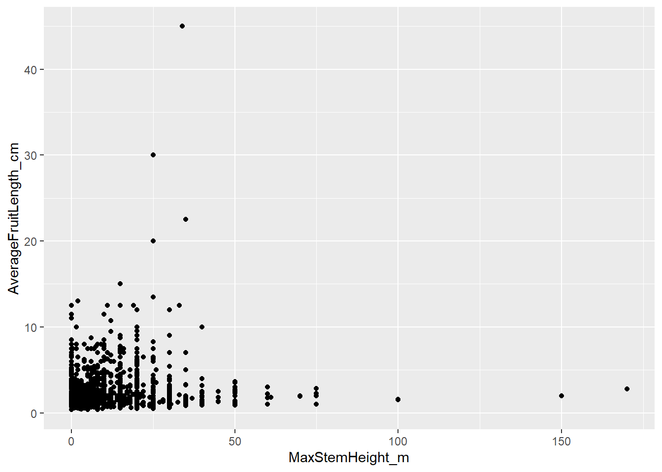
Here, each point represents one palm species. The x-axis shows maximum stem height, the y-axis shows average fruit length. Notice a few things:
- Most palms have short stems and small fruits, but there is a long tail of a few species with very large fruits and high stems.
geom_point()automatically removes rows withNAin either variable and prints a warning telling you how many were dropped.
2.7.7.1 Aesthetics: mapping variables to visual properties
aes() is not limited to x and y. Any visual property of a geom can be mapped to a variable:
| Aesthetic | Controls |
|---|---|
color |
Outline or point color |
fill |
Fill color (bars, boxes) |
size |
Size of points or lines |
shape |
Point shape (circle, triangle, etc) |
alpha |
Transparency (0 = invisible, 1 = opaque) |
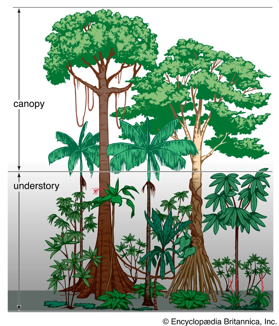
Let’s use the trait “UnderstoreyCanopy” to color the dots of this scatter plot. Understorey palms grow below the main forest canopy, in the shaded lower layers of the forest. They are usually smaller because they are adapted to live in low-light conditions and do not need to reach the top of the forest. Canopy palms reach the upper forest layer, where they have access to more direct sunlight. Because they grow taller and invest in large stems, we might also expect them to have larger fruits, although this pattern can vary among species.
By coloring the dots of our scatter plot we can explore whether palm species from the canopy tend to be taller and have larger fruits than understorey species.
# color each point by UnderstoreyCanopy
ggplot(data = species_traits,
       aes(x = MaxStemHeight_m,
           y = AverageFruitLength_cm,
           color = UnderstoreyCanopy)) +
  geom_point()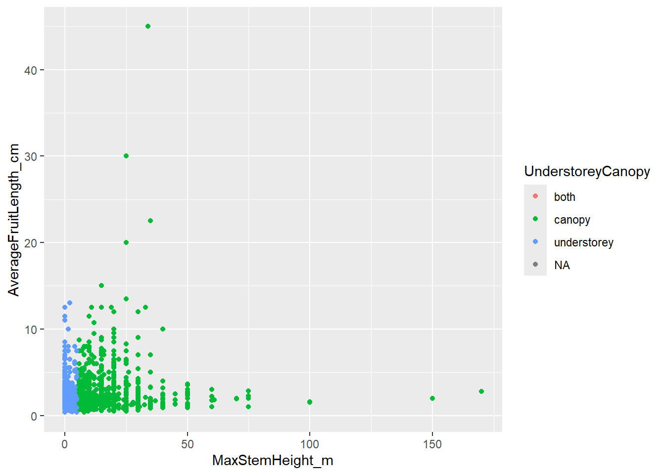
Wow, the correlation is very strong! We can definitely see that smaller palms are categorized as understorey (in blue), while larger palms are categorized as canopy (in green). Notice that the color of the dots has been randomly assigned and the legend has been made automatically.
Setting a fixed aesthetic outside aes():
You can also set an aesthetic to a fixed value — not mapped to any variable — by placing it outside aes(), directly inside the geom:
# All points in aquamarine color, semi-transparent (alpha),
# bigger (size) and shaped as a triangle
ggplot(data = species_traits,
       aes(x = MaxStemHeight_m, y = AverageFruitLength_cm)) +
  geom_point(color = "aquamarine4", alpha = 0.4, size = 4, shape = 17)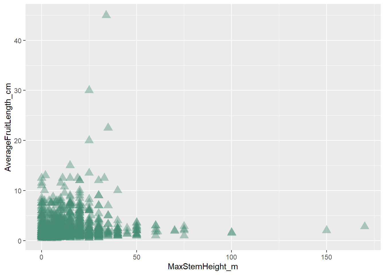
Common mistake: Putting
color = "aquamarine4"insideaes()does not produce colored points — it maps the string “aquamarine4” to color as if it were a variable, producing a single-colored legend with a nonsensical label. Always place fixed values outsideaes().
Here you can find a cheat sheet for color in R.
You can also manually customize the color for each group. Here, scale_color_manual() tells ggplot2 exactly which color to use for each category in UnderstoreyCanopy.
ggplot(data = species_traits,
       aes(x = MaxStemHeight_m,
           y = AverageFruitLength_cm,
           color = UnderstoreyCanopy)) +
  geom_point(size = 2, alpha = 0.5) +
  scale_color_manual(values = c(
    "canopy" = "darkolivegreen",
    "understorey" = "chocolate3"))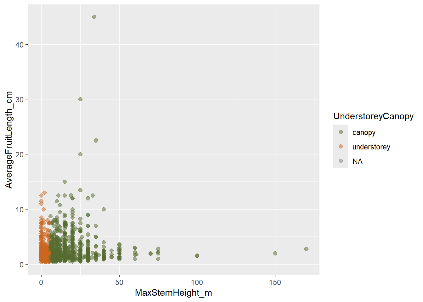
The names inside values = c(...) must match the group names in the data exactly, including spelling and capitalization. Then the legend will be created accordingly to the new colors.
2.7.8 Histograms - geom_histogram()
A histogram shows the distribution of one continuous variable by dividing its range into bins and counting how many observations fall in each bin. Histograms are useful because they help us see which values are common or rare, whether the data are evenly distributed or skewed, and whether there are unusual values or possible outliers.
Skewness means that the values of a variable are not evenly distributed around the centre. Instead, most values are concentrated on one side, with a long tail on the other side:
- Right-skewed / positively skewed: most values are small, tail extends to large values on the right.
- Left-skewed / negatively skewed: most values are large, tail extends to small values on the left.
# Distribution of maximum stem height across species
ggplot(data = species_traits,
       aes(x = MaxStemHeight_m)) +
  geom_histogram(binwidth = 5, fill = "forestgreen", color = "black")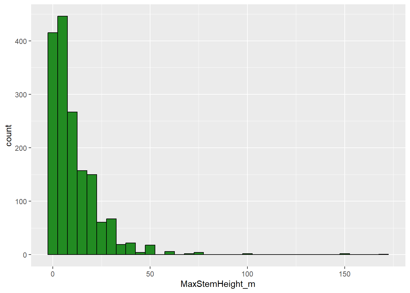
We can see that palm height is right-skewed, with most palm species having shorter stems, but a few species having very tall stems. Strongly skewed data can make patterns harder to see. One common solution is to transform the variable, for example with a log transformation, using scale_x_log10() which changes the x-axis scale to a logarithmic scale.
# The distribution is right-skewed — a log scale can help
ggplot(data = species_traits,
       aes(x = MaxStemHeight_m)) +
  geom_histogram(bins = 30, fill = "forestgreen", color = "black") +
scale_x_log10() 
For the untransformed histogram, binwidth = 5 means that each bar covers 5 meters of stem height. However, after adding scale_x_log10(), the x-axis is shown on a logarithmic scale. In this case, binwidth = 5 is no longer interpreted as 5 meters, but as 5 units on the log10 scale. This is much too wide, so most values are grouped into one large bar. For log-transformed histograms, it is often easier to fix the number of bins instead of controlling the width of each bin. We do this by using bins = 30, which tells ggplot2 to divide the transformed x-axis into 30 intervals automatically.
Notice that in the last plot, the x-axis still uses the original column name, MaxStemHeight_m. This label is not very readable and does not tell the reader that the axis is shown on a logarithmic scale. When we transform an axis, it becomes especially important to add clear custom labels:
# The distribution is right-skewed — a log scale can help
ggplot(data = species_traits,
       aes(x = MaxStemHeight_m)) +
  geom_histogram(bins = 30, fill = "forestgreen", color = "black") +
  scale_x_log10() +
  labs(x = "Maximum stem height (m, log scale)",
       y = "Number of species")
2.7.8.1 Bar charts - geom_bar()
A bar chart shows the number of observations in different categories.
Bar charts are useful when we want to compare counts among groups, for example how are palm species distributed across record types.geom_bar() counts rows for you. Use it when you want to visualize the frequency of a categorical variable.
# How are occurrence records distributed across record types?
ggplot(data = palm_traits,
       aes(x = basisOfRecord)) +
  geom_bar(fill = "darkmagenta") +
  labs(x = NULL,                 # does not print x-axis label
y = "Number of records") 
If you calculate the counts yourself (e.g. with count()), you can also use geom_col() instead and map y to your count column n:
# Top 10 countries by number of records
top_countries <- palm_traits %>%
  count(country, sort = TRUE) %>%
  head(10)

ggplot(data = top_countries,
       aes(x = reorder(country, n), y = n)) +
  geom_col(fill = "steelblue") +
  coord_flip() +             # flip axes so the labels are readable
  labs(x = "Country", y = "Number of records",
       title = "Top 10 countries for palm occurrence records") # adds a title to the plot
coord_flip() rotates the entire plot 90 degrees — a quick fix for long category labels. reorder(country, n) sorts the bars from smallest to largest — combined with coord_flip() this gives you a clean horizontal bar chart in descending order.
2.7.8.2 Box plots - geom_boxplot()
A box plot summarises the distribution of a numeric variable within one or more groups. The box shows the interquartile range, which contains the middle 50% of the data, from the 25th to the 75th percentile. The line inside the box is the median. The whiskers usually extend to values within 1.5 × the interquartile range, and points beyond the whiskers are shown individually as potential outliers.
Box plots are useful when we want to compare distributions among categories, for example whether canopy and understorey palms differ in maximum stem height. First, let’s filter NAs from the variable UnderstoreyCanopy. You can see here how we can combine the pipe from dplyr (%>%) and the + from ggplot2. Then you do not longer need to add species_traits as the data object in the ggplot() function:
species_traits %>%
  filter(!is.na(UnderstoreyCanopy)) %>% # first filter NAs in UnderstoreyCanopy
  ggplot(aes(x = UnderstoreyCanopy,
           y = MaxStemHeight_m)) +
  geom_boxplot()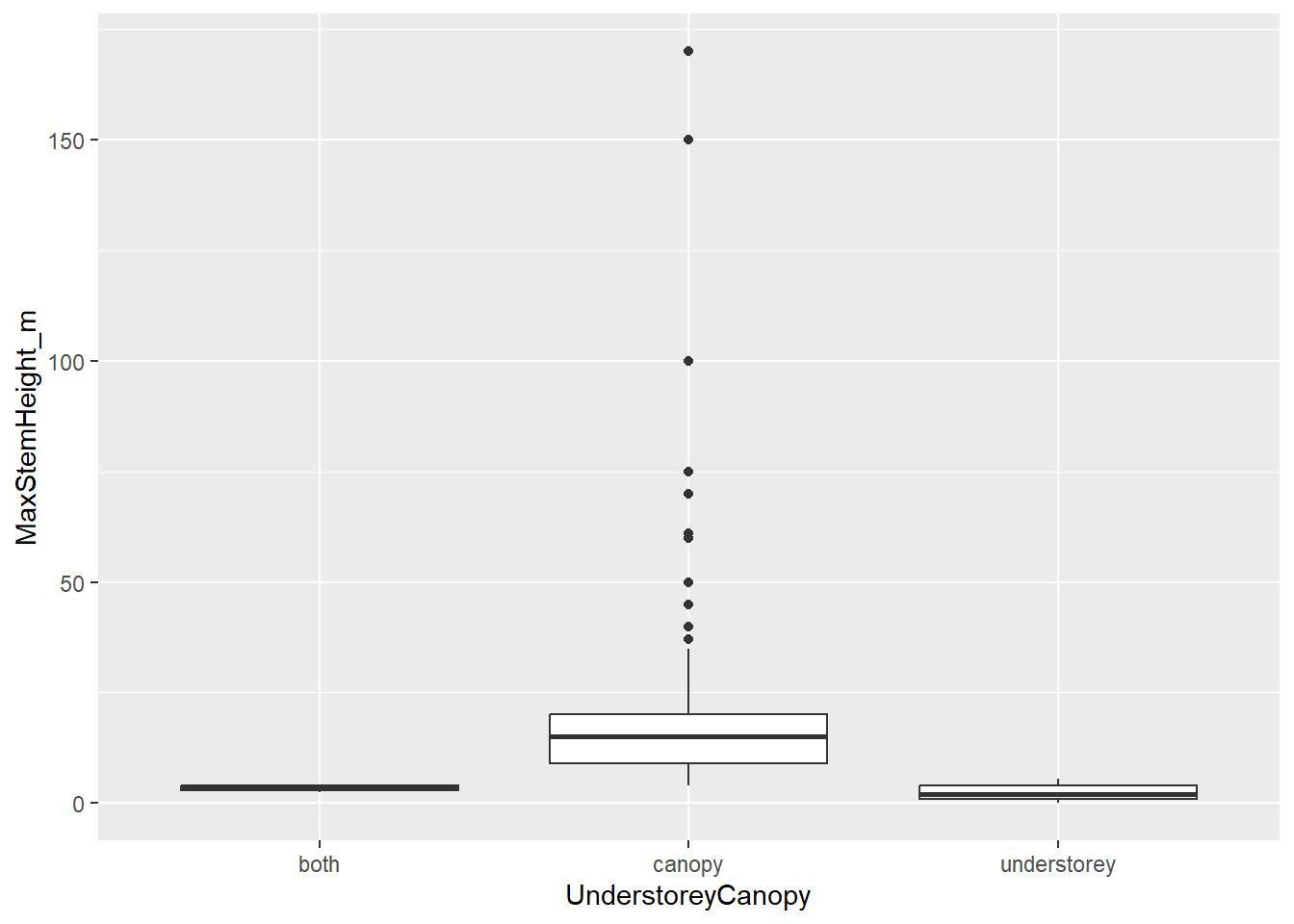
We could also explore how the most common genera of palms in our dataset differ in fruit length. We can add spcific color to the boxplots and another color to the potential outliers:
# Compare fruit length distributions across the five most-recorded genera
top_genera <- palm_traits %>%
  count(genus, sort = TRUE) %>%
  head(5) %>%
  pull(genus)   # extract the genus names as a vector

top_genera
## [1] "Geonoma" "Bactris" "Oenocarpus" "Attalea" "Euterpe"palm_traits %>%
filter(genus %in% top_genera) %>% # filter the dataset to only contain the vector names top_genera
select(genus, species, AverageFruitLength_cm) %>%
distinct() %>%
ggplot(aes(x = reorder(genus, AverageFruitLength_cm, median, na.rm = TRUE),
y = AverageFruitLength_cm)) +
geom_boxplot(fill = "darkgoldenrod2", outlier.color = "firebrick") +
labs(x = "Genus", y = "Average fruit length (cm)",
title = "Fruit length distribution in five common palm genera")
reorder(..., median, na.rm = TRUE) sorts the genera by their median fruit length, which makes the pattern much easier to read than alphabetical order.
2.7.8.3 Facets - facet_wrap()
Faceting splits a single plot into a grid of panels, one per level of a categorical variable. This is one of the most powerful tools in ggplot2 for comparing patterns across groups.
# Relationship between stem height and fruit length,
# separately for five common genera
palm_traits %>%
  filter(genus %in% top_genera) %>%
  select(genus, species, MaxStemHeight_m, AverageFruitLength_cm) %>%
  distinct() %>%
  ggplot(aes(x = MaxStemHeight_m, y = AverageFruitLength_cm)) +
  geom_point(alpha = 0.5, color = "steelblue") +
  facet_wrap(~ genus, ncol = 3) +
  labs(x = "Max stem height (m)",
       y = "Avg fruit length (cm)",
       title = "Stem height vs fruit length by genus")
facet_wrap(~ genus) creates one panel per genus. ncol = 3 controls how the panels are arranged. Each panel shares the same axis scales, making the distributions directly comparable. The faceting here allows us to see that the relationship between stem hight and fruit size is not the same across the different genera.
2.7.8.4 Themes: controlling the overall appearance
A theme controls all non-data elements of a plot: background color, grid lines, font size, legend position, and so on. ggplot2 ships with several complete themes:
p <- ggplot(data = species_traits,
            aes(x = MaxStemHeight_m, y = AverageFruitLength_cm)) +
  geom_point()

p
p + theme_grey()       # default (grey background)
p + theme_bw()         # white background, black frame
p + theme_classic()    # white background, no grid, axis lines only
p + theme_minimal()    # white background, subtle grid, no frame
p + theme_light()      # light grey lines and axes
For scientific publications, theme_classic() or theme_bw() are common choices. You can further adjust individual theme elements with theme(), including text size, axis text, legend text, and legend position.
species_traits %>%
  filter(!is.na(UnderstoreyCanopy)) %>% # first filter NAs in UnderstoreyCanopy
  ggplot(aes(x = MaxStemHeight_m,
           y = AverageFruitLength_cm,
           color = UnderstoreyCanopy)) +
  geom_point(size = 4, alpha = 0.5) +
  scale_color_manual(values = c(
    "canopy" = "darkolivegreen",
    "understorey" = "chocolate3")) +
  labs(x = "Maximum stem height (m)",
       y = "Average fruit length (cm)",
       color = "Forest layer") +  # changes the axis names and the legend title
  theme_light() +
  theme(
    axis.title = element_text(size = 14), # changes the size of the x- and y-axis titles
    axis.text = element_text(size = 12), # changes the size of the axis numbers
    legend.title = element_text(size = 13), # changes the size of the legend title
    legend.text = element_text(size = 11), # changes the size of the legend labels
    legend.position = "bottom") # moves the legend below the plot
2.7.8.5 Saving plots with ggsave()
ggsave() saves the most recently printed plot (or any ggplot object) to disk.
# Save the last plot printed on the R Plots panel
ggsave("plots/stem_vs_fruit.png", width = 8, height = 6, dpi = 300)

# Save a specific plot object
my_plot <- ggplot(data = species_traits,
                  aes(x = MaxStemHeight_m, y = AverageFruitLength_cm)) +
  geom_point(alpha = 0.4, color = "steelblue") +
  theme_classic()

ggsave("plots/stem_vs_fruit.pdf", plot = my_plot, width = 8, height = 6)widthandheightare in inches by default.dpi = 300is standard for print-quality figures.- Supported formats include
.png,.pdf,.svg, and.jpg.
2.7.9 ☕ Active break
Open https://www.data-to-viz.com. This interactive guide helps you choose the right chart type based on your data. Can you find a chart type we have not covered today that could work for the palm data?
2.7.10 Tasks:
1. Has palm sampling effort increased over time?
Biodiversity data is not collected uniformly through history. The number of occurrence records in a dataset often reflects how intensively people were collecting or observing in a given period — not just where palms actually grew.
Using palm_traits, create a histogram of the column year. Use a binwidth of 5 years, and apply a different theme_(). Add meaningful axis labels and customized colors.
- Around which year were most records collected?
- What could explain the strong increase you see in recent decades?
2. Are conspicuous fruits larger than cryptic ones?
Fruit conspicuousness — whether a fruit is brightly colored and easy to spot or dull and cryptic — is thought to be related to how the fruit is dispersed. Conspicuous fruits are often adapted to attract visually-oriented animals such as birds and primates. These animals tend to be larger and may disperse larger seeds. This leads to a prediction: conspicuous fruits should be larger on average than cryptic ones.
Using species_traits, first delete NAs across Conspicuousness. Then create a box plot comparing AverageFruitLength_cm between the two levels of Conspicuousness. Color the boxes using colors of your choice. Add axis labels and a title.
- Is one forest layer associated with more conspicuous fruits?
3. Is fruit conspicuousness distributed differently between canopy and understorey palms?
We have already seen that canopy palms are taller and have larger fruits. But is fruit conspicuousness also different between forest layers? Light conditions differ dramatically between the canopy and understorey, which may affect which animals visit each layer and therefore which dispersal strategies are favoured.
Using species_traits, first delete NAs across UnderstoreyCanopy and Conspicuousness. Then create a filled bar chart that shows the proportion of conspicuous versus cryptic species in each forest layer. Use ggplot() with UnderstoreyCanopy on the x-axis and map Conspicuousness to fill. Use position = "fill" inside geom_bar() to show proportions instead of counts. Add scale_y_continuous(labels = scales::percent) to display the y-axis as percentages.
- Is one forest layer associated with more conspicuous fruits?
4. Which countries have the highest ratio of canopy to understorey records?
Sampling in the field is not neutral. Open habitats and forest edges are easier to access than the deep forest understorey, and tall canopy palms are more visible than small understorey species. This means that the ratio of canopy to understorey records in a country may reflect not only the true palm community but also where and how collectors worked.
Using palm_traits, first create an object called top_countries containing the 10 countries with the most palm records. Then, remove rows where country or UnderstoreyCanopy is missing. Then create a stacked proportional bar chart (like task 3, but now one bar per country) showing the proportion of records from canopy versus understorey palms. Use coord_flip() and order the countries by their total number of records using reorder(). Use the same colors for “conspicuous” and “cryptic” as you used in the previous figure.
- Do you think this reflects real ecological differences, or sampling artefacts?
2.7.11 Color in scientific visualisation
color is one of the most powerful tools in data visualization. It can help readers see patterns quickly, distinguish groups, and understand important trends.
However, color is also easy to misuse. Poor color choices can make a figure confusing, misleading, or inaccessible to readers with color vision deficiencies. In scientific figures, color should always be chosen deliberately, not only because it looks nice.
The first question should always be:
Do we need color at all?
Not every plot needs color. If a figure can be understood clearly in black, white, and grey, that is often the best choice. color should be used when it adds information: for example, to distinguish groups, show a continuous gradient or highlight a pattern. Unnecessary color can distract from the main message and make the plot harder to interpret.
Once you have decided to use color, you must ask the next important question:
What kind of variable are we showing with color?
Different types of variables need different types of color scales.
| Type of color scale | Use for | Example variables |
|---|---|---|
| Qualitative | Categories with no natural order | Forest layer, country, genus |
| Sequential | Ordered numeric values from low to high | Stem height, year, species richness |
| Diverging | Values that vary around a meaningful midpoint | Temperature anomaly, correlation coefficient, model residuals |
For example, a continuous variable such as stem height should not be shown with a random set of unrelated colors. A palm that is 10 m tall is not a completely different “type” from a palm that is 15 m tall. The color scale should show a gradual change from low to high values.
2.7.11.1 Qualitative colors: showing groups
Use a qualitative color scale when the variable contains categories with no natural order.
For example, UnderstoreyCanopy has two categories: canopy and understorey. These are groups, not continuous values.
ggplot(data = species_traits,
       aes(x = MaxStemHeight_m,
           y = AverageFruitLength_cm,
           color = UnderstoreyCanopy)) +
  geom_point(alpha = 0.5, size = 2) +
  scale_color_manual(values = c(
    "canopy"      = "darkolivegreen",
    "understorey" = "chocolate3")) +
  labs(x = "Maximum stem height (m)",
       y = "Average fruit length (cm)",
       color = "Forest layer") +
  theme_classic()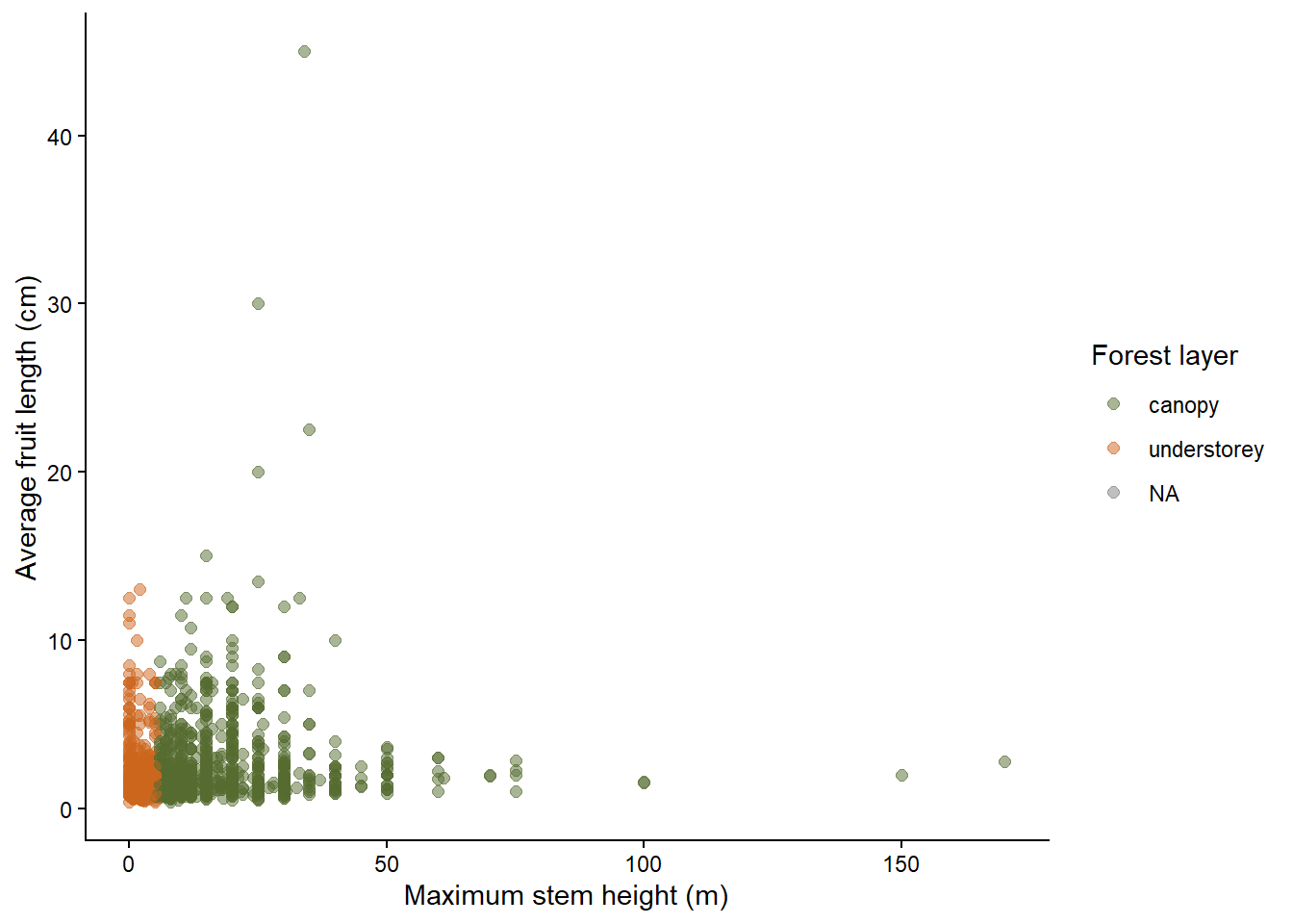
Here, color is used to distinguish two biological groups. The colors do not imply that one group is “higher” or “lower” than the other.
2.7.11.2 Sequential colors: showing numeric values
Use a sequential color scale when color represents a numeric variable that increases from low to high. The viridis palettes are a good default because they are perceptually uniform, color-blind friendly, and readable in greyscale.
For example, we can color palm species by maximum stem height:
ggplot(data = species_traits,
       aes(x = MaxStemHeight_m,
           y = AverageFruitLength_cm,
           color = MaxStemHeight_m)) +
  geom_point(alpha = 0.6, size = 2) +
  scale_color_viridis_c() +
  labs(x = "Maximum stem height (m)",
       y = "Average fruit length (cm)",
       color = "Stem height (m)") +
  theme_classic()
This is appropriate because MaxStemHeight_m is a continuous numeric variable. The color changes gradually as stem height increases. The _c in scale_color_viridis_c() means continuous. For categorical variables, use _d: scale_color_viridis_d(). It will automatically assign viridis colors to the different categorical values.
species_traits %>%
  filter(!is.na(UnderstoreyCanopy)) %>%
ggplot(aes(x = MaxStemHeight_m,
           y = AverageFruitLength_cm,
           color = UnderstoreyCanopy)) +
  geom_point(size = 3) +
  scale_color_viridis_d() +
  labs(x = "Maximum stem height (m)",
       y = "Average fruit length (cm)",
       color = "Forest layer") +
  theme_classic()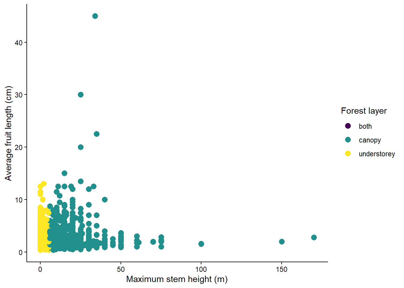
2.7.11.3 Color vision deficiency
Approximately 8% of men and 0.5% of women have some form of color vision deficiency (CVD). The most common type is red-green deficiency (deuteranopia / protanopia), which makes red and green look similar. A figure that relies on red vs. green to distinguish groups is unreadable by a significant fraction of your audience. Practical rules:
- Avoid red–green as the only distinguishing cue.
- Prefer blue–orange or blue–red contrasts for two-group comparisons — both are CVD-safe.
- Combine color with a second cue (shape, line type, position) when possible; this also helps in black-and-white print.
The ColorBrewer palettes (available via scale_color_brewer()) were designed for cartography with CVD accessibility in mind and work well for qualitative and sequential data with a small number of categories.
2.7.11.4 Recommended reading
- Wilke CO (2019) Fundamentals of Data Visualization. Chapter 4: color scales. https://clauswilke.com/dataviz/color-basics.html
- Crameri F, Shephard GE & Heron PJ (2020) The misuse of color in science communication. Nature Communications 11: 5444. https://doi.org/10.1038/s41467-020-19160-7
- Coloring for Colorblindness: https://davidmathlogic.com/colorblind/#%23D81B60-%231E88E5-%23FFC107-%23004D40